

That map is interesting, because it shows a way higher rate of infection in the two county area I live in than my state's website that was updated yesterday. 4x as many in one county, and 6x as many in the other.Interesting graphic showing spread of infections using per capita measurement...
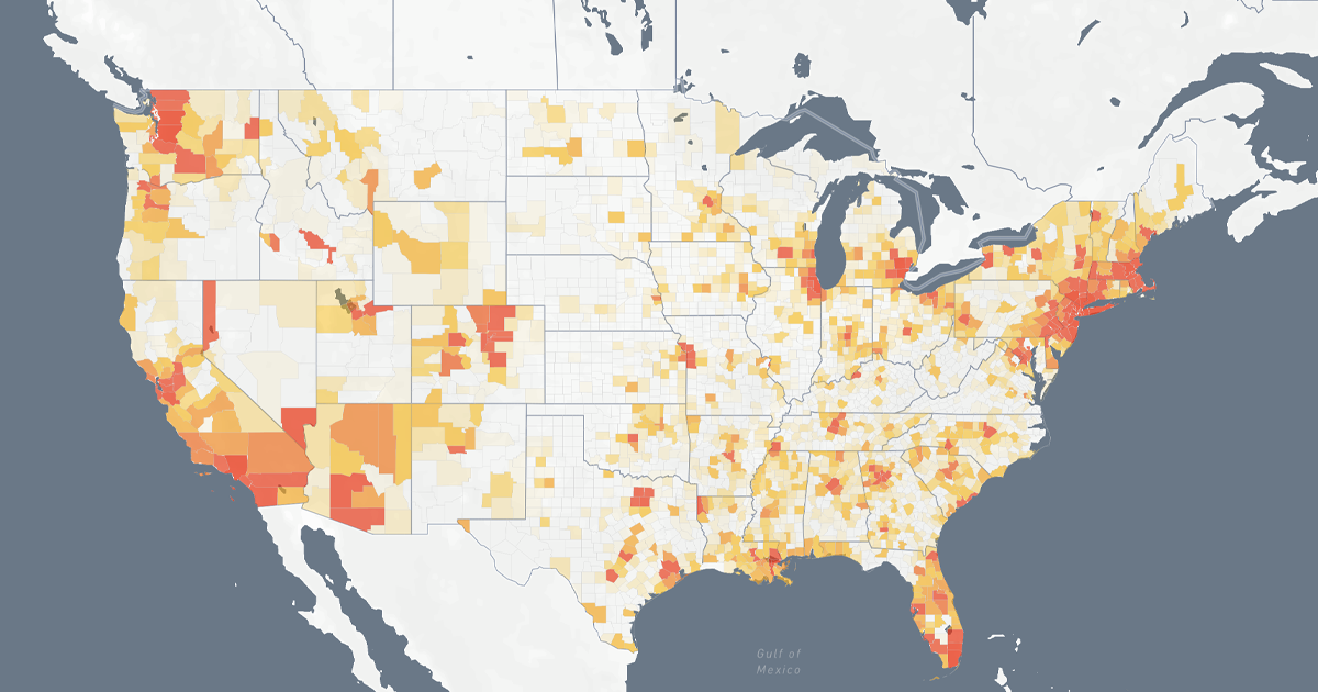
COVID-19 Cases Per 10,000 People
A per 10,000 people view of the COVID-19 outbreak in the United States.www.coronashutdown.com
Image below is what it looks like today... Hit play, and watch the animation.
From this, it appears Denver was really the first Metro area with a major outbreak. 50 cases per 100k on March 10.
View attachment 17317
You are using an out of date browser. It may not display this or other websites correctly.
You should upgrade or use an alternative browser.
You should upgrade or use an alternative browser.
Fauci Says there is a way sports (ie Professional Sports) can resume this summer.... this does not sound good for softball to return before fall...
- Thread starter wheresmycar
- Start date
- Status
- Not open for further replies.

- May 16, 2016
- 946
- 93
That map is interesting, because it shows a way higher rate of infection in the two county area I live in than my state's website that was updated yesterday. 4x as many in one county, and 6x as many in the other.
Are you looking at the cumulative numbers? That is weird. It's matches our county numbers almost exactly.
radness
Possibilities & Opportunities!
- Dec 13, 2019
- 7,270
- 113
Hurray reasonable again !!Those of us who are married should know that telling somebody that they shouldn't feel a certain way, whether those feelings are rational or not, rarely is a productive activity. People are panning, BEGGING to open up states to save the economy but now are mocking things that will help some people feel safe enough to go out and spend their money..cannot have it both ways.
________________________
Wonder how it will pan out?
Will it be,...
The peoples choice to conform or not?
Or standards implemented
To weed out people who dont conform giving the choice
to adapt make changes and overcome?
There will still be diversity!
Last edited:
- Jun 11, 2015
- 1,175
- 48
Those of us who are married should know that telling somebody that they shouldn't feel a certain way, whether those feelings are rational or not, rarely is a productive activity. People are panning, BEGGING to open up states to save the economy but now are mocking things that will help some people feel safe enough to go out and spend their money..cannot have it both ways.
Are you saying the piece of cloth over their mouth is not protecting everyone who is working and shopping but we shouldn't tell them that so they 'feel' safe?
Recently went to a large metro area hospital that has an entire floor set up for Chirona virus patients. When I walked in I was asked to remove my new out of the wrap N95 mask and was given a cheap cloth mask by the medical professionals. I was hesitant but later found out they dont have a single Chirona virus patient.
- Jun 11, 2015
- 1,175
- 48
That's a great point. Just because a business opens, does not mean the same number of customers will return. The economic impact of the closure is far from over. As an example, I seriously doubt buffet restaurants will ever be the same. Likewise, salad bars at your local super market will probably change forever as well.
Salmonella at buffets is more of a hazard than Chirona. The buffet has a sneeze gard just like a checker at the grocery store. Fear mongering is the only thing keeping things locked down.
- May 16, 2016
- 946
- 93
out of the wrap N95 mask
If your N95 has an exhale valve, it does not filter the air you exhale, thus you could spew your germs all over the hospital. The masks are not to protect you, the masks are meant to contain your germs, so you don't contaminate the hospital. They don't have any covid 19 patients, and they don't want you creating any.
")
Ironic, the guy mocking masks, has his own N95... Maybe you think there is a global pandemic in progress?


Salmonella at buffets is more of a hazard than Chirona. The buffet has a sneeze gard just like a checker at the grocery store. Fear mongering is the only thing keeping things locked down.
The customers will decide what they want to buy and what they don't want to buy. My guess is that more than a few people will shy away from buffets for whatever reason you want to provide. I'm not saying the reason is valid. Just that sales will suffer because of it. Unfortunately perception is reality for a lot of people out there.
- Jun 11, 2015
- 1,175
- 48
These numbers are nearly useless. Chirona test kits are extremely limited. If everyone had a test we could get some real numbers.Interesting graphic showing spread of infections using per capita measurement...
COVID-19 Cases Per 10,000 People
A per 10,000 people view of the COVID-19 outbreak in the United States.
Image below is what it looks like today... Hit play, and watch the animation.
From this, it appears Denver was really the first Metro area with a major outbreak. 50 cases per 100k on March 10.
View attachment 17317
- May 16, 2016
- 946
- 93
Salmonella at buffets is more of a hazard than Chirona. The buffet has a sneeze gard just like a checker at the grocery store. Fear mongering is the only thing keeping things locked down.
Says the guy wearing a N95 mask... LOL Maybe if we all had our own N95 masks, we'd be as brave as you.

- Oct 2, 2017
- 2,283
- 113
Those of us who are married should know that telling somebody that they shouldn't feel a certain way, whether those feelings are rational or not, rarely is a productive activity. People are panning, BEGGING to open up states to save the economy but now are mocking things that will help some people feel safe enough to go out and spend their money..cannot have it both ways.
i will not mock those who want to wear PPE out in public. That is until they start criticizing and telling me that I'm the reason why the virus is going around. That I'm inconsiderate of others. That I need to stay. Then the gloves are off LOL
- Status
- Not open for further replies.